How to Adjust Photo Color Before Exporting a Watermark Image
Field photos are not always captured in ideal light. Some arrive underexposed, washed out, or too flat for a timestamp block to read clearly. Color adjustment helps you fix the base image before the documentation overlay is finalized.
The Color panel is for that job. It is not about making the photo artistic. It is about making the record clear enough to review.
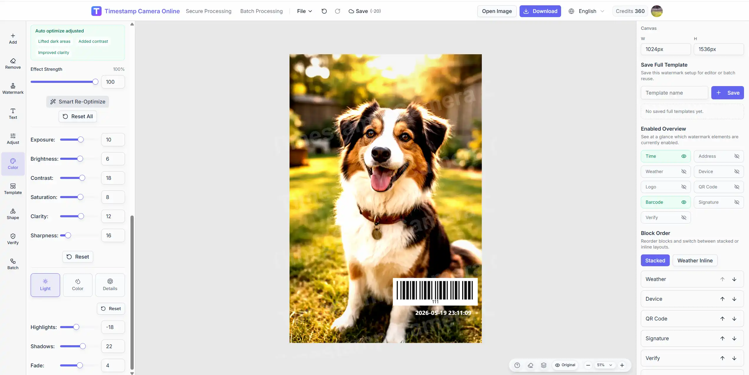
When color adjustment matters
Color correction is especially useful when:
- the photo was taken indoors with weak lighting
- the sky or pavement washes out the timestamp text
- the image looks dull in a report archive
- you need consistent brightness across many photos from one visit
- the overlay text needs stronger contrast against the background
If the photo is already clear and the timestamp reads well, you may not need much correction at all.
What the Color panel includes
Open the editor, upload your image, then select Color on the left.
You will find:
Scene presets
Quick starting points for common image conditions.
Auto optimize
A one-step improvement path when you want a cleaner base image before manual fine-tuning.
Basic controls
Exposure, brightness, contrast, saturation, clarity, and sharpness.
Advanced controls
Highlights, shadows, temperature, tint, vignette, and related tone adjustments.
A practical color workflow
Step 1. Fix the base image before obsessing over text color
If the photo is too dark, brighten the image first. A white timestamp on a muddy background will still be hard to read.
Step 2. Try a scene preset or auto optimize
Use these as a fast starting point, then adjust only what the preview still needs.
Step 3. Check the timestamp area specifically
Look at the corner or footer where the documentation block will sit. That region matters more than the overall aesthetic score.
Step 4. Reset if the image starts to look unnatural
Documentation photos should look believable. Over-sharpening or extreme saturation can make a record feel edited in the wrong way.
Need color correction and watermark export together?
Use the full editor to adjust tone, place the timestamp block, and export in one browser session.
Best practices for documentation photos
Favor readability over style
Your goal is a photo that still looks credible in a report, not a heavily filtered social image.
Keep one look across a batch
If you are processing many photos from the same visit, similar color treatment makes the set feel more professional.
Re-check after crop or rotation
Framing changes can alter how bright or dark the overlay area appears.
Common mistakes
Making the photo look overprocessed
Strong records should still look like records.
Adjusting color after placing too many overlays
Fix the base image first when possible.
Ignoring the export preview
The final downloaded image is the real test, not just the live preview moment.
Related guides
- Crop and rotate before watermark export
- Complete timestamp camera guide
- Batch add timestamp to photos
Final takeaway
Color adjustment supports the documentation layer. Open Color, improve the base image enough for the timestamp to read clearly, then export once the photo still looks credible for the workflow behind it.